How to visualize a layer
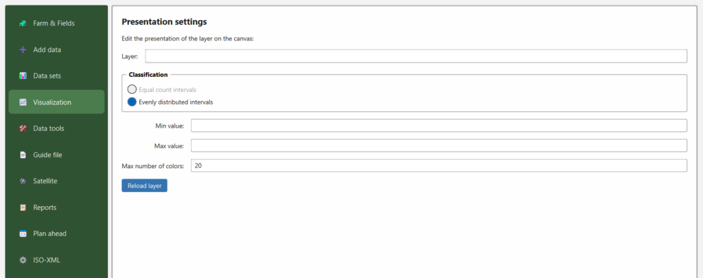
The 📈 Visualization section controls how a data layer is coloured on the QGIS canvas, so variation across the field is easy to read.

The Presentation settings section


The Presentation settings section

Steps

  1. Layer — choose the layer to style (the data sets you added to the canvas under Data sets).
  2. Classification — choose how values are grouped into colour classes:
  • Equal count intervals — each colour class holds roughly the same number of points (quantile style). Good for skewed data.
  • Evenly distributed intervals — classes of equal value width between the min and max.
  1. Min value / Max value — the range to stretch the colours over. Leave blank to use the layer’s own minimum and maximum, or set them to compare several fields/years on the same scale.
  2. Max number of colors — how many colour steps to use (default 20).
  3. Reload layer — applies the settings and redraws the layer on the canvas.

Tips

  • Setting a fixed Min/Max across layers makes different fields or years directly comparable.
  • Fewer colours give a clearer, more “zone‑like” map; more colours show finer gradients.

Version 3.0.0 was released 2026-06-12

X
Scroll to Top